Flexbox: porting a float layout
Recently I tweeted a lot about flexbox, both asking for resources and then later, professing my love for it. Before my most recent project, I had dabbled in flexbox just a bit, mostly using it for any side by side layout I needed on this site. On a recent project, I dove in head first after realizing it could solve one major layout problem and I am so glad I did.

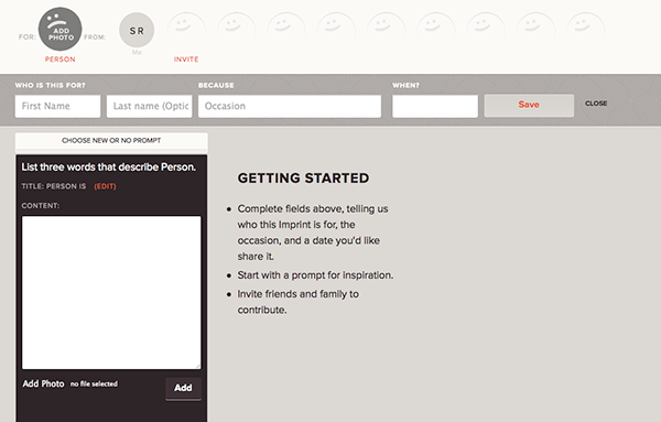
I’ve been working with the folks at Imprint to get their application front end up and running in time for the private beta and continuing on beyond that. When talking over a crucial part of the layout of one of the main pages, it became apparent that being able to control the order of content based on something other than source order in the code was necessary. Using order in flexbox solved this problem. The first item in the markup could remain the last item seen in a long list of boxes as content was added by the user. The only rub? The design wouldn’t quite work with flexbox, so I was stuck. That’s when the Product Design lead, the designer, and I met to discuss options. They agreed to a tweak in the design and I was off to the races redoing the main grid layout with flexbox.

For my situation, I took what was an existing grid layout using floats, since I had already created that, and modified it to use flexbox, retaining the float version for an IE CSS file (although you could also do a Modernizr type test for these styles). So I still have the .grid class for float clearing or display: flex and the .grid-col is still in my markup, to do the floating for older IE. Although I’m hoping to make some changes to clean up the markup in the future. I still have all my columns by width but in the flexbox version they are using flex: 0, 0, [percentage width]. The final piece in the flexbox version was to decide on spacing, so I put in justify-content: space-between. And guess what? IT JUST WORKED. And when I tested in IE 9? It worked fine with the float fall back.
Even better? I made my way down to the Mobile Portland device lab and tested my layout in Android 2.3, Android 4.3, Blackberry Z10 (Blackberry OS 10), Windows phone running Windows 8 and the only device to give me a problem on layout? The Windows phone, but it isn’t a gigantic problem, that too was amazing to me. In testing on iOS 6 and 7 at home, they both worked as well. Testing on VMs for IE 9-11; ALL GOOD (with the fallback for IE9 and below). It is truly awesome to have the layout fall into place so well and work across so many devices.

In addition? The content ordering is working well. The developers and I set up a way to do it easily with classes and in older browsers and IE9 and below, it doesn’t matter that it isn’t in the right order as the application is still usable. Good old progressive enhancement FTW!
There are parts of flexbox that I am still struggling with, I admit. flex-grow and flex-shrink aren’t completely clear to me yet. But to be honest, most designers I know are using some type of grid, so they want to have a layout that is proportional, which for me means putting a width on my flex items. But the transition for me was so smooth and so easy that I am really excited to use this on future projects. At this point I’m questioning if I would use floats again for main layout, because the new layout systems are supported so well and so much easier to use.
The real advantages? Using space-between to figure out gutters and order; being able to choose content order based on something other than source order. I’ll be honest, this all still feels so futury to me, so unexpected, yet so lovely.
Many thanks to Max Fenton and Jason Grigsby for giving me feedback on this post.